Since approx 6 months I’m maintaining my portfolio via the Lending Robot. Time to look back which features I’m using and which not.
Portfolios: Primary, Secondary, External
It sounds great: 3 different Portfolios, different Settings for each Portfolio, with the external Portfolio I can handle investments by myself. Sounds nice but finally I just checked the functionality and never really used it.
Deleted!
Secondary Market
My investement showed bad performance. After a short period of time I’ve above average delays and defaults. You’ve to be very careful which loan is bought to which price!
Deleted until new idea comes up!
HTML
The whole page was shown in one HTML page => 3 graphs plus Portfolio Settings plus investment list is far too much to dsiplay on one site. Therefore it’s splitted now in 4 separate pages:
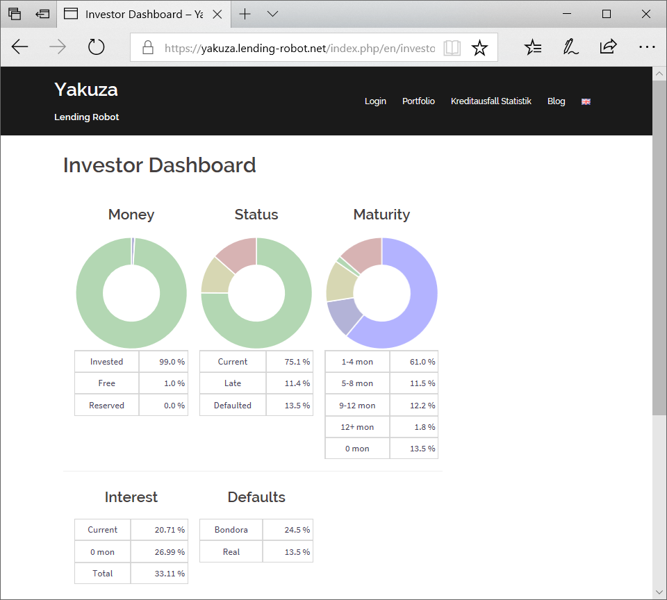
Dashboard
The „great Overview“on your Portfolio:
How much money is invested, reserved, free?
How many loans are current, late, defaulted?
What’s the maturity of your loans?
How high ist he interest?
Comparison Bondora Probability of Default vs. Real Defaults

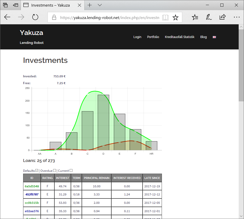
Investments
A more detailed view on your Portfolio
Graph showing investment amount, target curve and defaults
List with all investments including filtering and sorting

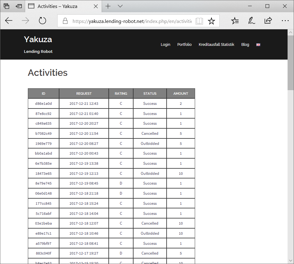
Activities
Which bids were placed and how’s the status? How many times loan offers were cancelled or outbidded in the last 30 days?

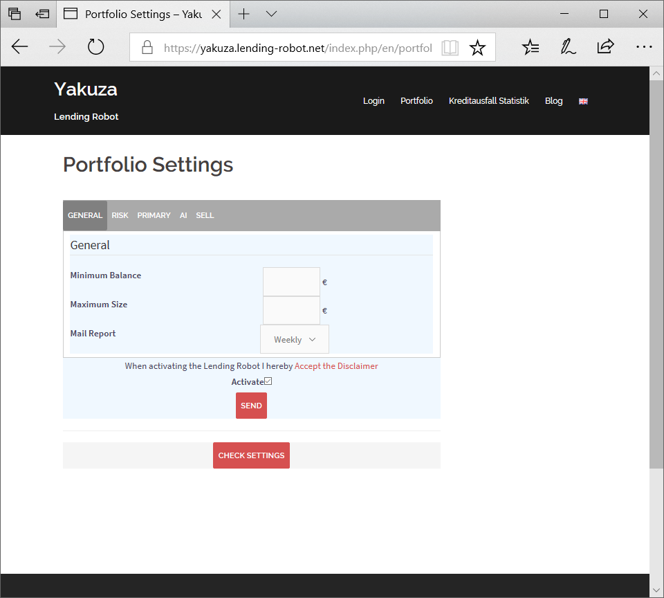
Settings
Page showing all possible settings plus check on these settings based on Bondora loans offered in the last 3 months. Very helpful to check different setting values!


