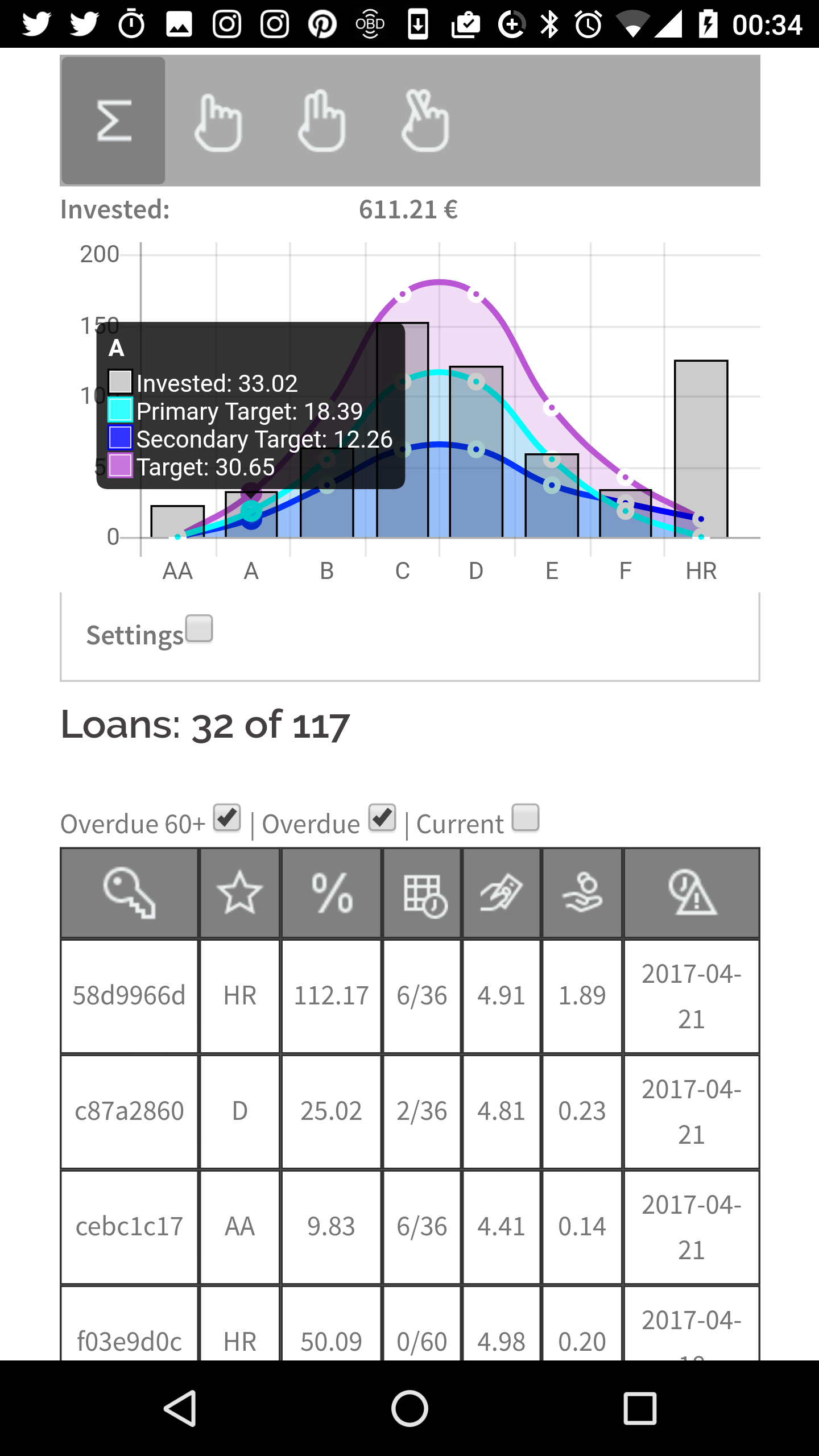
After working on the frontend design for the browser I concentrate now on the design for the Smartphone view. Goal is to get a fast overview on the investments. I want to check this on the fly. E.g. how much money is invested and how many loans are late. Due to the fact that the width of the Samrtphone is quite limited I decided to take some small pictograms as heading texts. This ensures an efficient usage of the available width and I get a fast investment overview.
Also the german and english translations are now available so the pages can be viewed in both languages.


